Visual identity
Tabú
- Brand
- Tabú
- Discipline
- Brand identity, Visual identity, Social content
- Industry
- Digital media
Work by Valentina Esnaola, co-founder of Fees.
Introduction
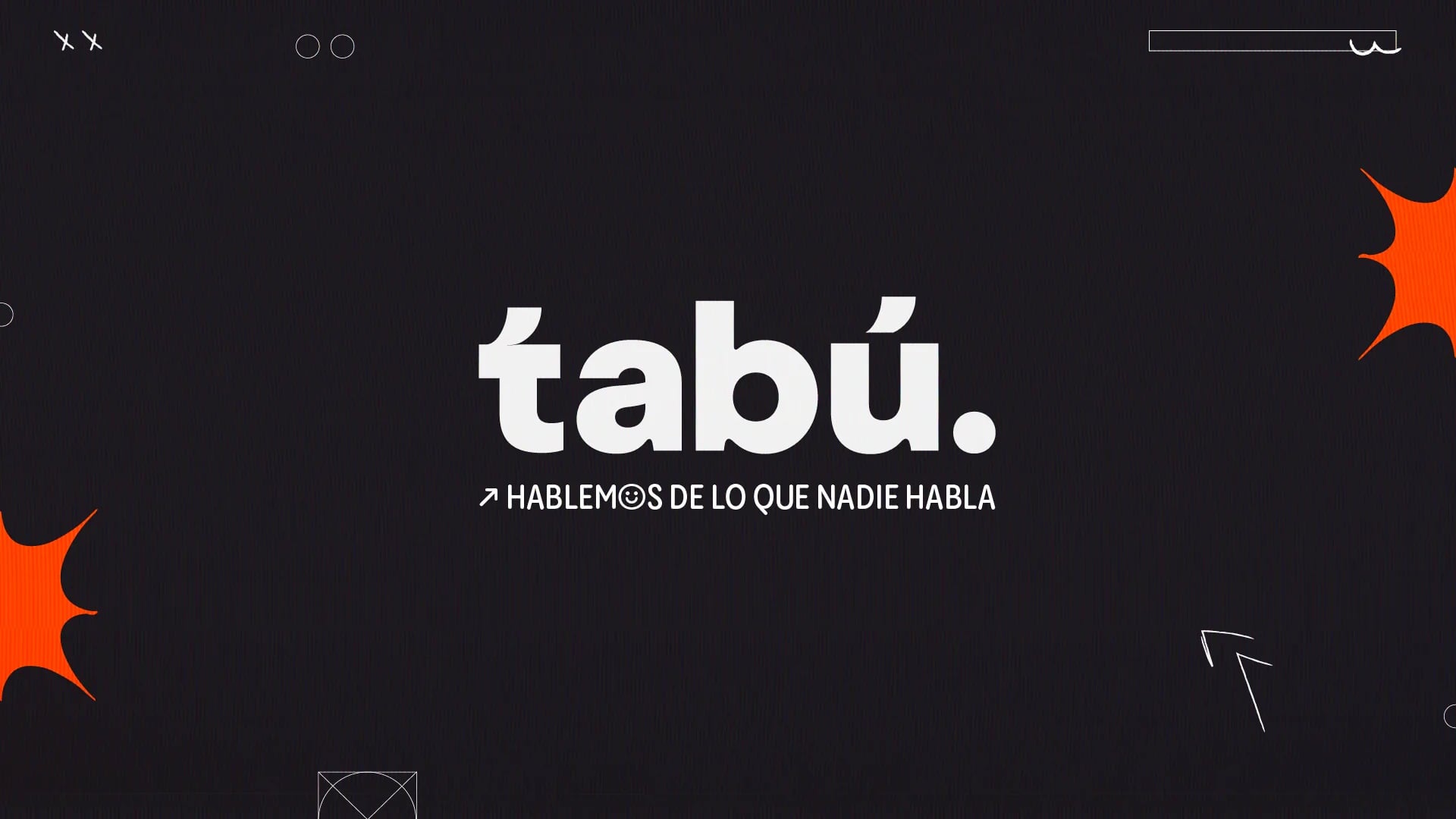
A visual identity designed to start conversations, for a digital media platform for young adults.
- Context
- Tabú is a digital media platform created for young adults, focused on current affairs, culture, social issues and the conversations people often avoid.
- Objective
- Tabú needed to feel disruptive enough to capture attention, but also open and friendly enough to invite people into the conversation.
- Concept
- Breaking the silence surrounding certain subjects.
Visual journey
A visual identity designed to start conversations.
A language that adapts
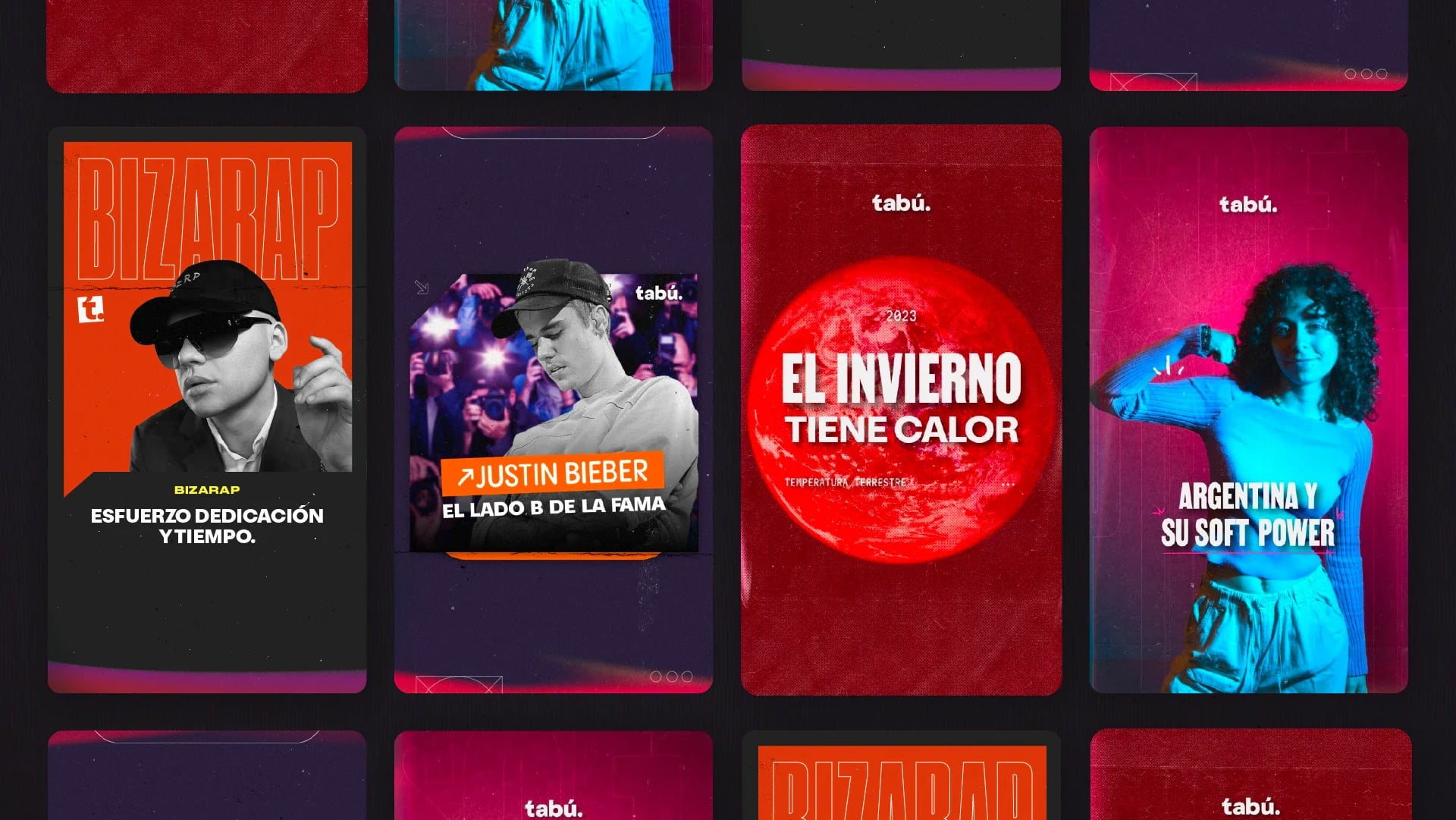
Rather than a rigid editorial system, a visual language that can constantly adapt. The contrast between bold headlines, expressive imagery, saturated colors and more spontaneous graphic details reflects the diversity of the topics the platform covers.
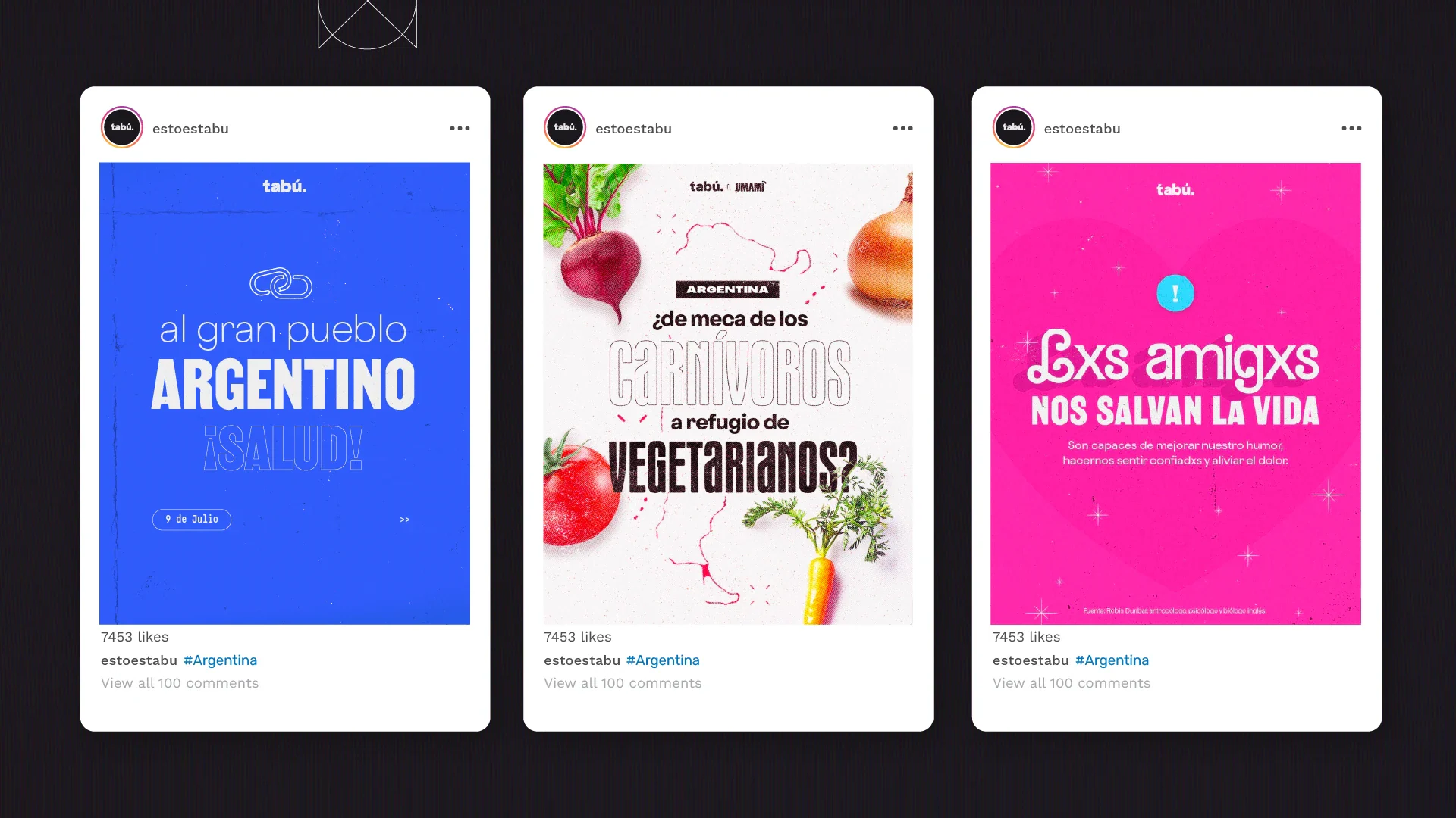
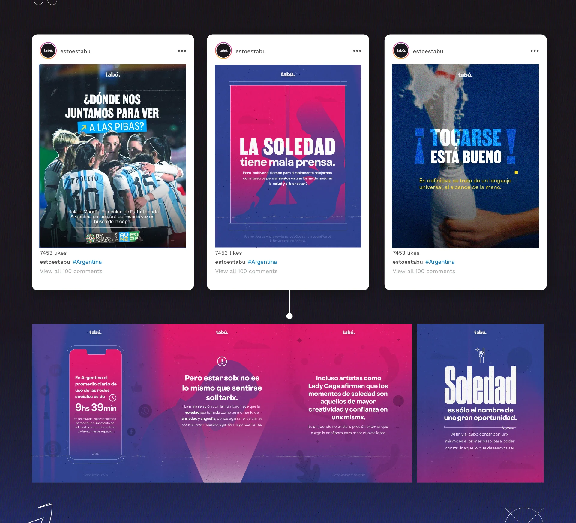
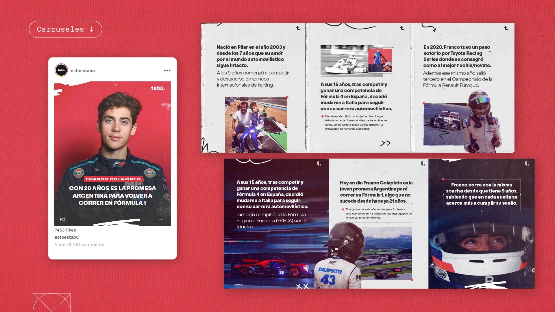
The result is a brand that feels opinionated without being aggressive, and informative without becoming distant or overly institutional.
Final applications
Intention
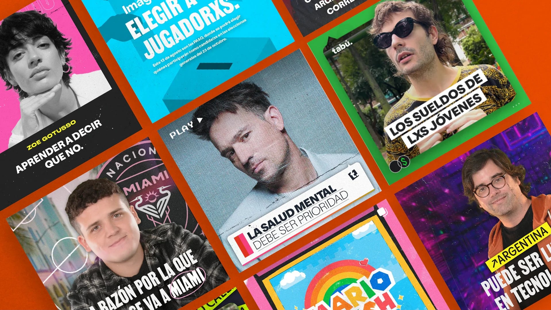
An exploration of how visual design can make information feel more accessible and create a genuine connection with its audience: every piece visually engaging, but also intentional, clear and connected to the subject it communicates.
Enough structure to feel consistent, and enough freedom to stay dynamic, relevant and responsive to the conversations around it.
Full credits
- Brand design
- Valentina Esnaola
- Social content design
- Valentina Esnaola
- Visual design
- Valentina Esnaola
- Tools
- Adobe Illustrator, Adobe Photoshop
- Originally published on Contra
- contra.com/p/qZreZcoY-tabu-visual-identity-design
Work by Valentina Esnaola, co-founder of Fees.