
Brand identity
Cumberland Dental Specialists
- Brand
- Cumberland Dental Specialists
- Discipline
- Brand identity
- Industry
- Healthcare · Dental practice
- Year
- 2025
Work by Valentina Esnaola, co-founder of Fees.
Introduction
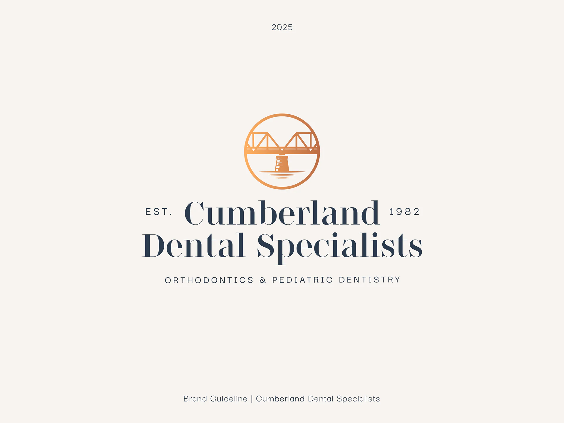
A rebrand for a long-established dental practice in Rhode Island, drawn from the town’s bridge, river and mills.
- Context
- Cumberland Dental Specialists is a long-established dental practice in Cumberland, Rhode Island, specializing in orthodontics and pediatric dentistry.
- Objective
- A rebrand built around its history, local presence and connection to the community: warm, trustworthy and established, while still contemporary and approachable.
- Concept
- The identity takes inspiration from Cumberland itself: its historic bridge, riverside landscape, old mills and architectural heritage.
Visual journey
Sense of place
These local references became the foundation of the brand, helping the practice feel connected to the place and to the generations of families it has served since 1982.
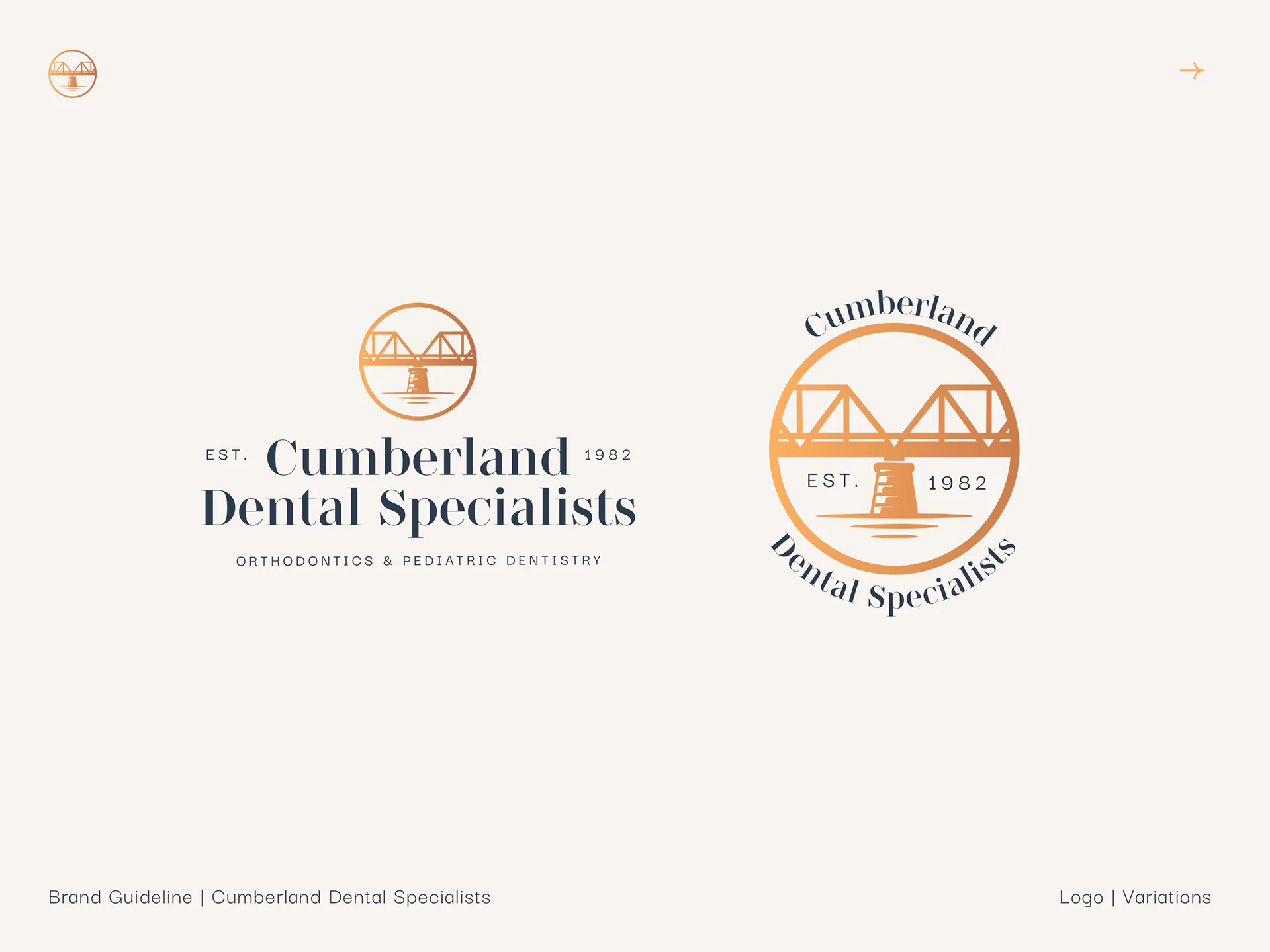
Pediatric version
For pediatric dentistry there is a secondary variation of the same logo. The bridge, structure, typography and overall identity stay intact, and a small child holding a balloon appears: a warmer, more playful character without creating a separate brand.
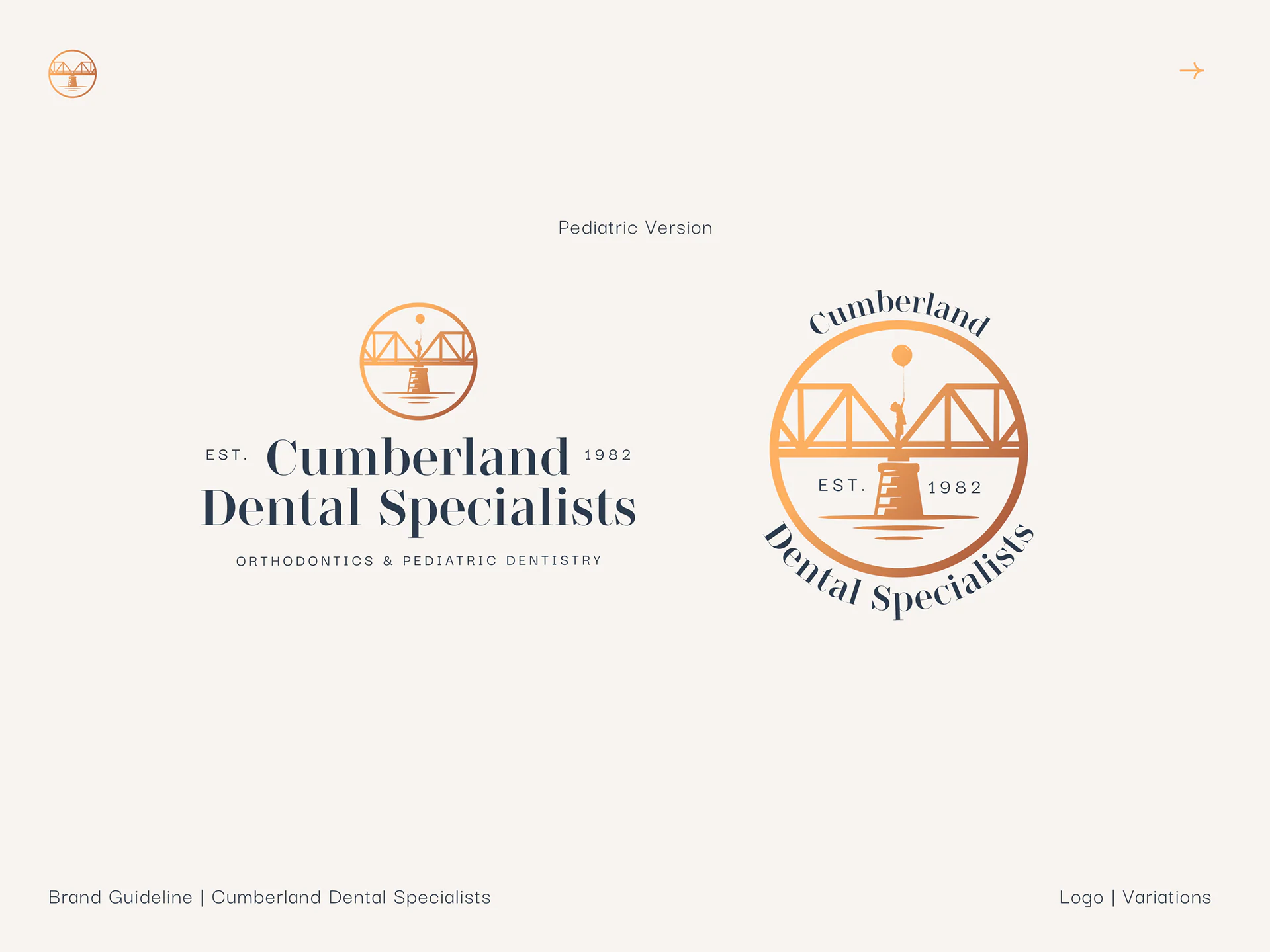
Both versions belong to the same visual system and can coexist depending on the audience and context.
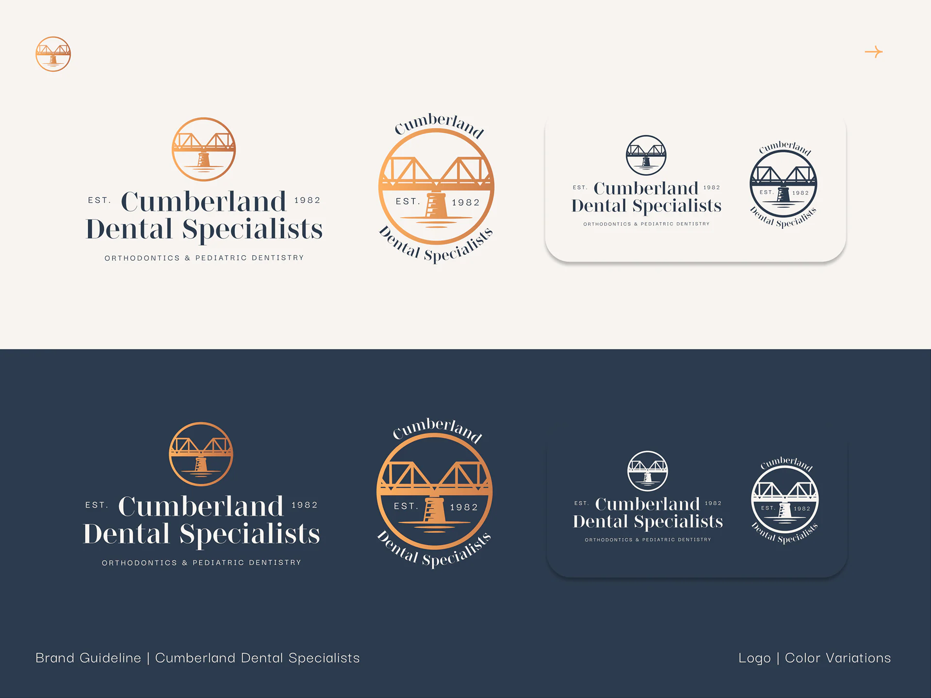
- #2C3B4E
- #FDB062
- #F7F4F0
Supporting system
The supporting visual system translates Cumberland’s local heritage into subtle shapes and patterns: bridge arches, river-like curves, seals, grids and architectural details.
Final applications
Applications
These elements appear throughout stationery, signage, digital communication, uniforms and everyday objects, reinforcing the sense of place without relying on literal dental imagery.
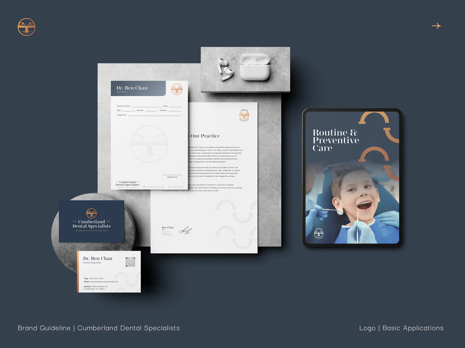
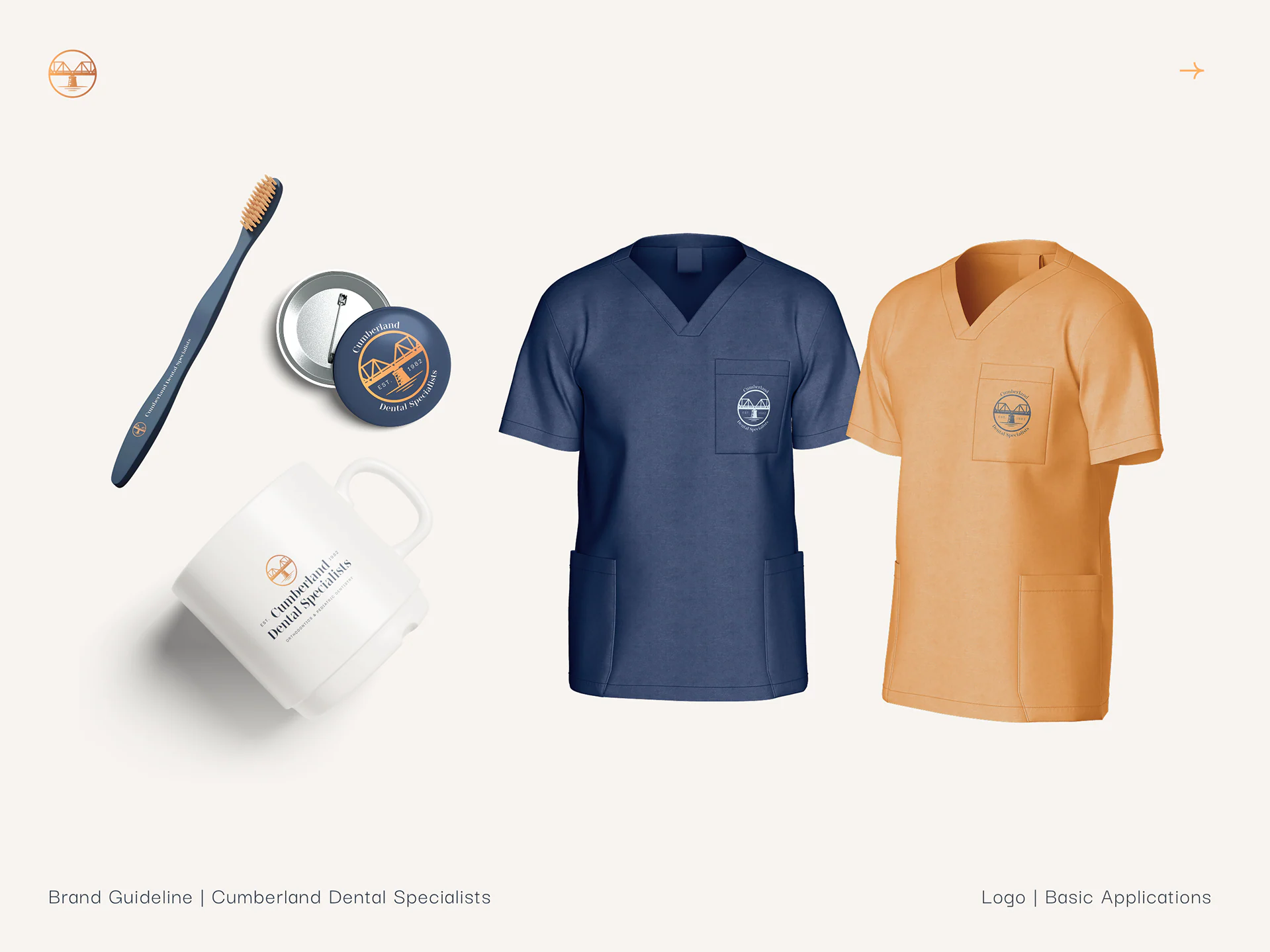
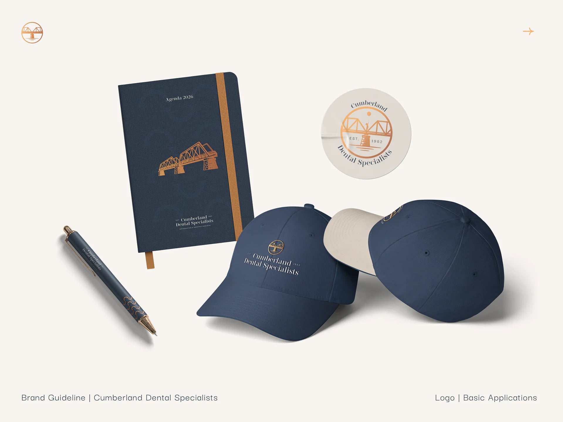
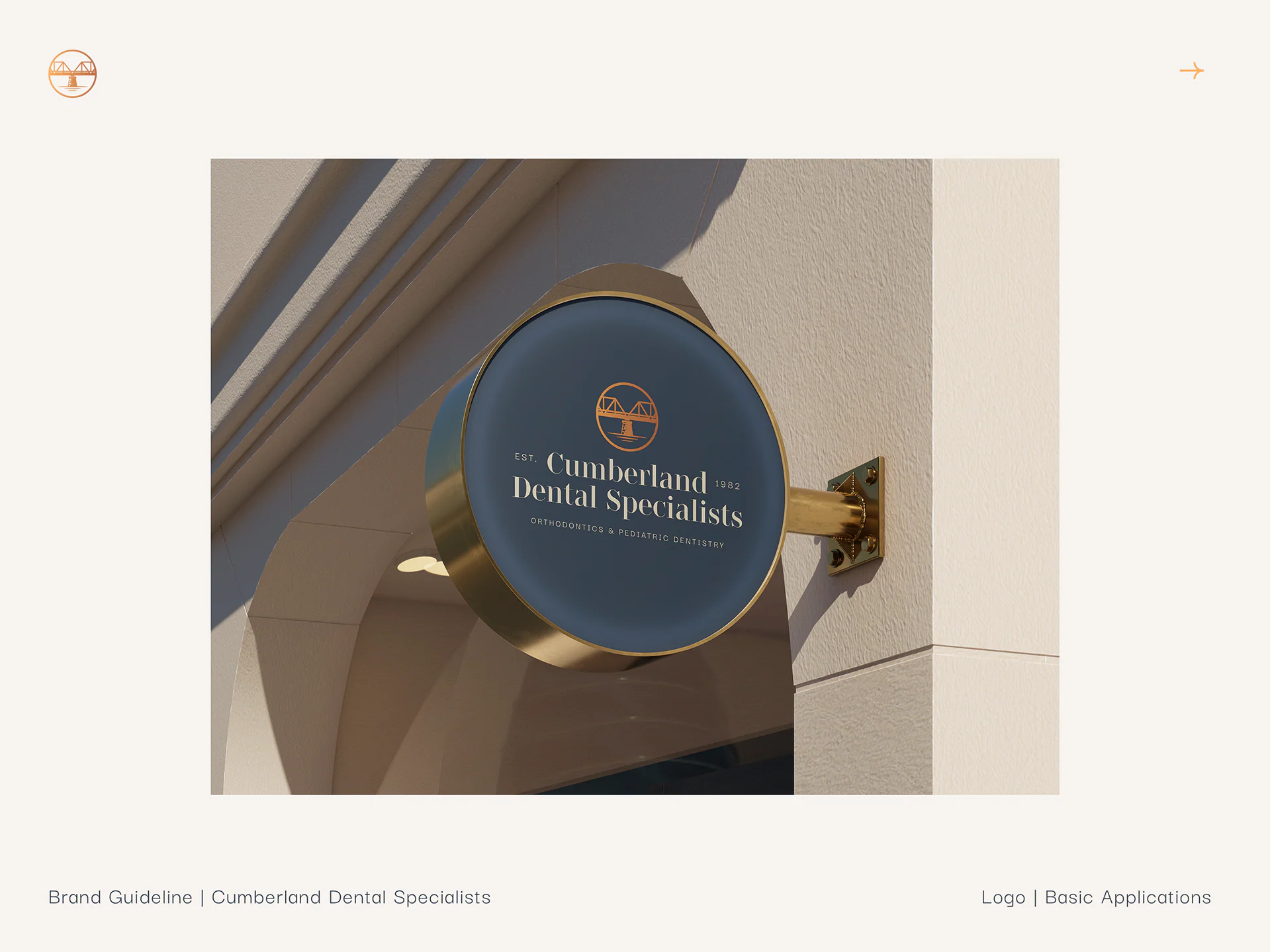
Legacy, community and care in a visual system that feels distinctly Cumberland.
Full credits
- Brand design
- Valentina Esnaola
- Tools
- Adobe Illustrator, Adobe Photoshop, Figma
- Originally published on Contra
- contra.com/p/YcXPE7WR-cumberland-dental-specialists-brand-identity
Work by Valentina Esnaola, co-founder of Fees.