
Brand identity
Albertina Café
- Brand
- Albertina
- Discipline
- Brand identity
- Industry
- Hospitality · Café
- Year
- 2026

Work by Valentina Esnaola, co-founder of Fees.
Introduction
A warm, expressive identity for a neighborhood café made to become part of everyday routine.
- Context
- Albertina is a neighborhood café designed around warmth, familiarity and everyday connection: a place for different moments of the day, meant to become part of the neighborhood’s routine.
- Concept
- The café as a host: a space that welcomes, accompanies and creates room for things to happen.
Visual journey
The café as a host
The identity is built around the idea of a space that welcomes, accompanies and creates room for things to happen. Routine, conversation, shared tables and spontaneous plans become part of the brand experience.
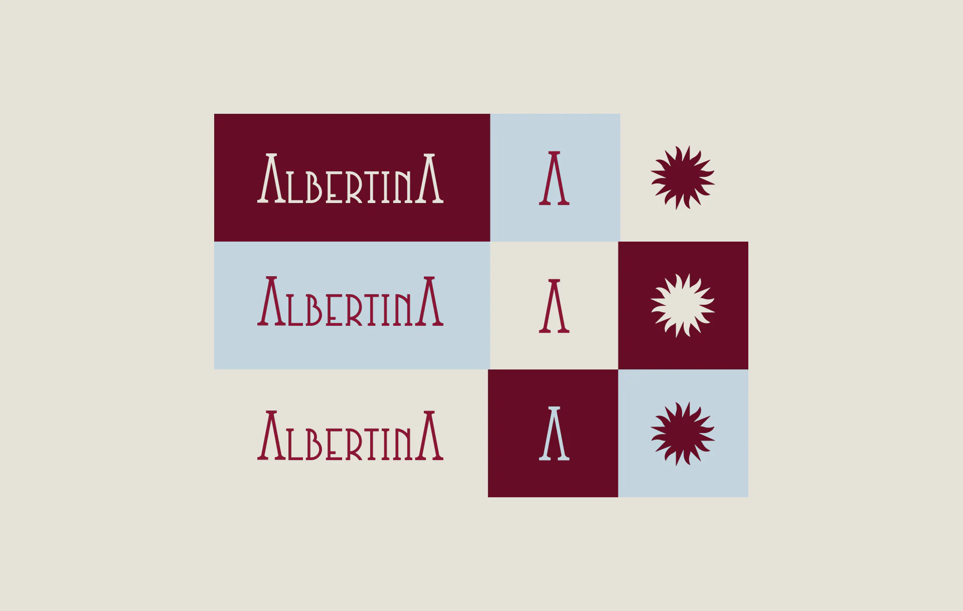
- #891535
- #C3D4DE
- #660C25
- #E6E2D9
Visual identity
A warm and expressive system combines a distinctive wordmark with an organic sun, stripes, handwritten details and small illustrations inspired by café life. Burgundy, soft blue and warm neutrals reinforce its familiar yet contemporary character.
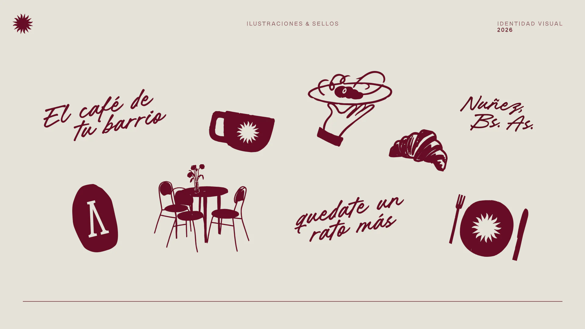
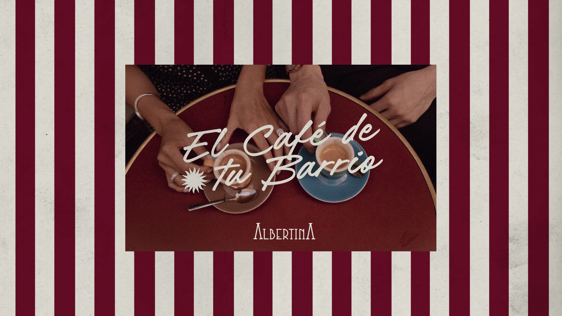
The system expands through phrases, seals, illustrations and photography of lived-in tables, shared food and spontaneous moments. Each element helps Albertina feel active, social and closely connected to its neighborhood.
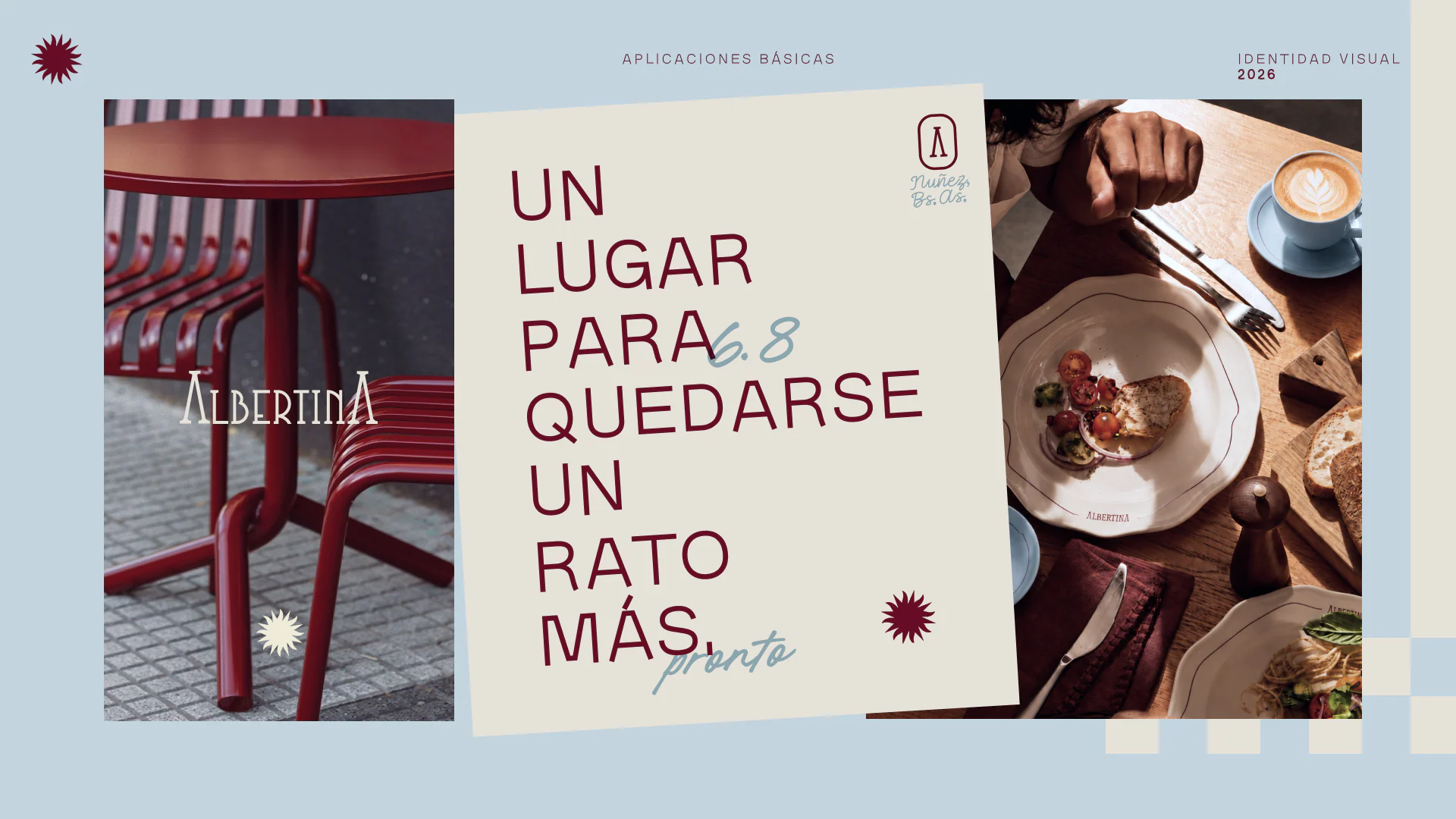
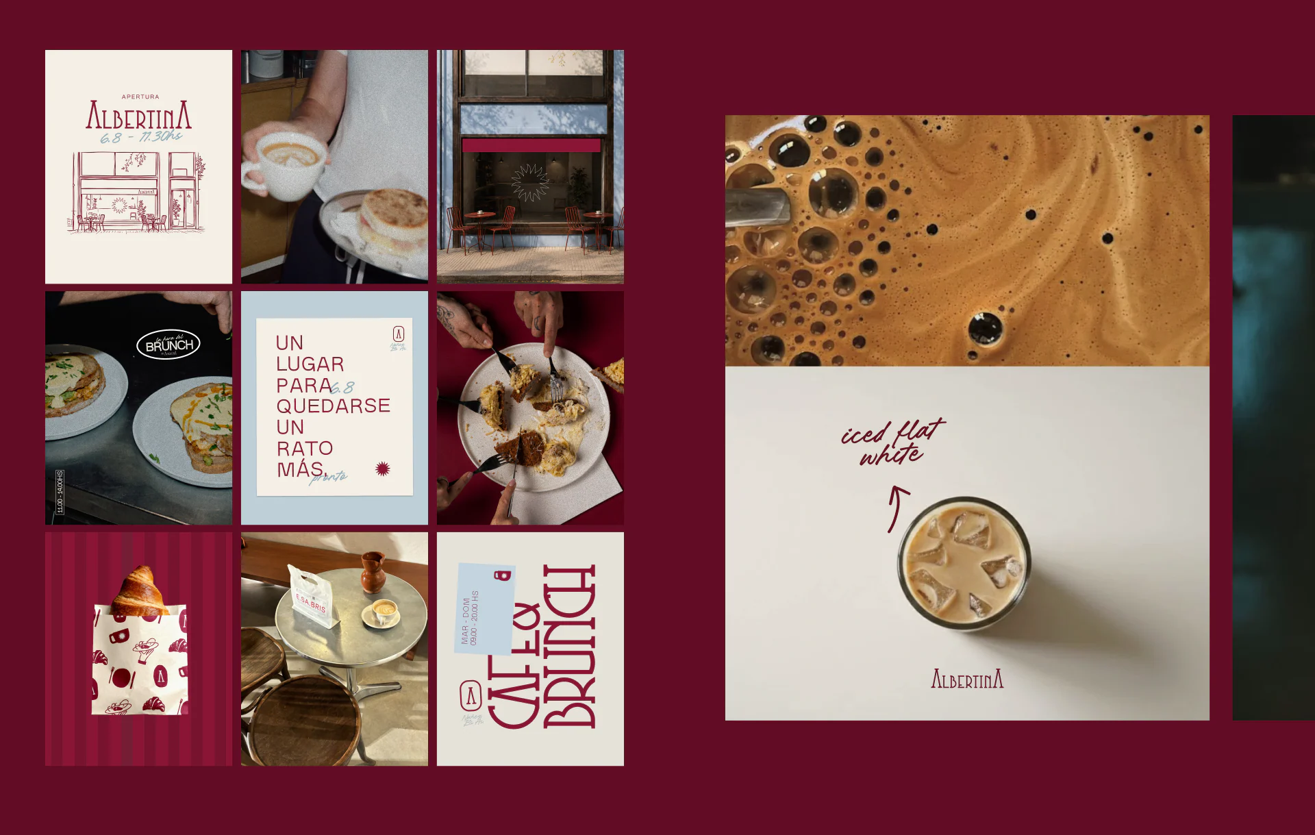
Final applications

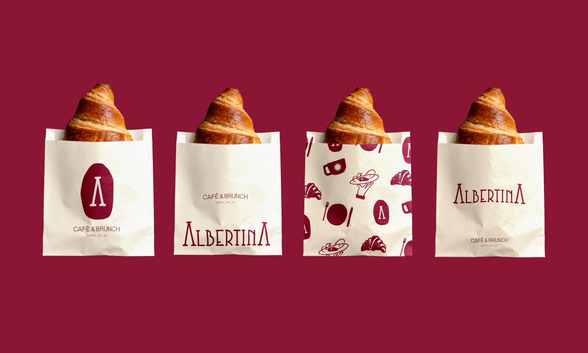
Albertina turns the everyday café into a place for meeting, staying and coming back: an identity built to feel familiar from the first visit.
Full credits
- Brand design
- Valentina Esnaola
- Tools
- Adobe Illustrator, Adobe Photoshop, Figma
- Originally published on Contra
- contra.com/p/ZqUrZNBF-albertina-cafe-brand-identity-design
Work by Valentina Esnaola, co-founder of Fees.